CPU Anomaly Detection
In order to correctly identify an anomaly it is important that the detection method be accurate. CPU is no longer enough of a measurement to scale applications. Other factors such as garbage collection, crypto, and other tasks placed in libuv's thread pool can increase the CPU usage in a way that is not indicative of the application's overall health. Even applications that don't use Worker threads are susceptible to this issue.
In addition, there is no cross-platform way of measuring the CPU usage per thread, which doesn't mean that CPU is useless. CPU and event loop utilization (or ELU) is crucial to see if an application is reaching hardware limitations. But not being able to gather metrics on a per-thread basis drastically limits our ability to determine when the application is reaching its threshold.
Note: ELU(Event loop utilization) is the ratio of time the event loop is not idling in the event provider to the total time the event loop is running, and is equal to the loop processing time divided by the loop duration.
With that being said, N|Solid Console provides ELU-based Scatterplot, which utilizes the most reliable metric to use as a baseline for comparison.
The ELU Scatterplot
The Scatterplot is an animated graph that provides an overview of your applications' performance across all or a subset of connected processes, when an specific process has at least one active worker thread, the process will be highlighted.
Using ELU as the axis to compare metrics across multiple processes is a reliable way to identify anomalies without false positives. With this information anomalous processes can be automated to take CPU profiles, heap snapshots and etc.
In the N|Solid Console, go to the the applications dashboard and click CPU ANOMALY DETECTION.
![]()
The blue dots are the raw data. Red line is the regression line (estimated average), yellow and green are the error from the regression.
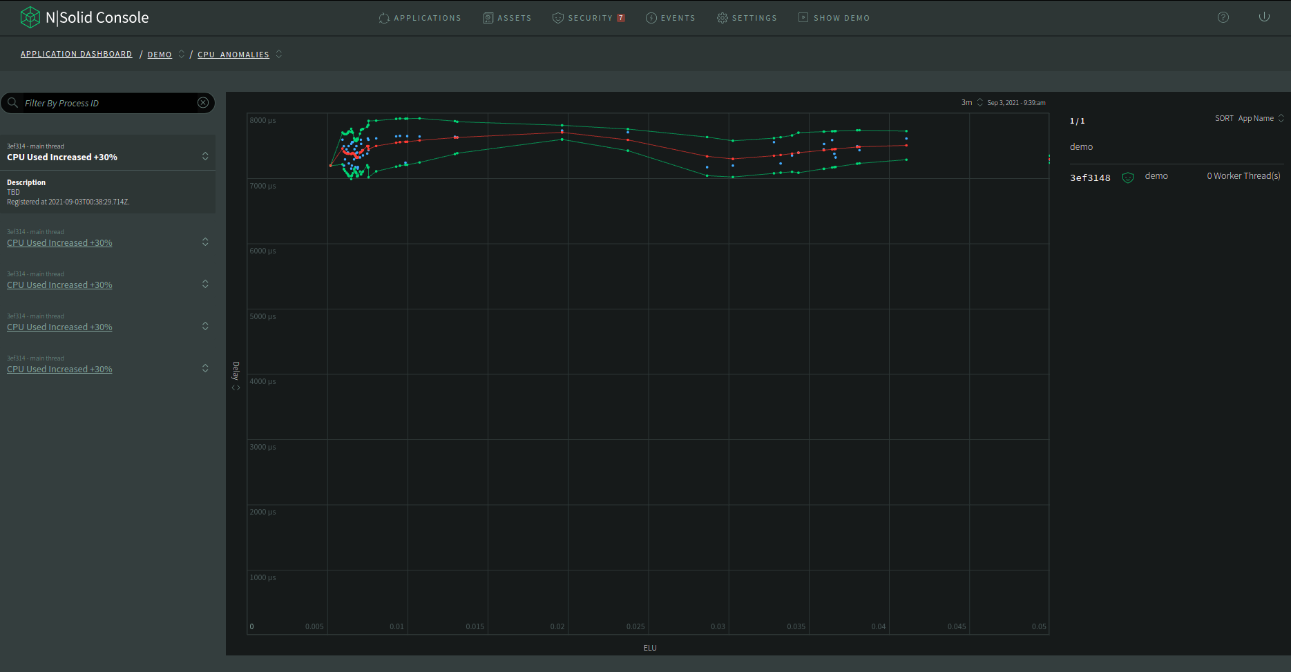
The default y-axis value is delay, which equals to (providerDelay + processingDelay) / 1e6 in microseconds.
-
The blue dots: The blue dots are the raw data from all the applications. All the application raw data are the same color. It only highlights the points from the same application when a single point is hovered with the mouse.
-
The red line: The red line is the moving average of all the raw data (blue dots). There is no application specific information to show when those points are hovered.
-
The yellow and green line: The yellow and green lines are the error margin for the moving average (red dots).
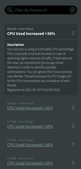
Anomalies List
At the left side, there's a list of anomalies which can be filtered by
agent ID. To see the details of an anomaly, click the title of an item to
expand it and read the description.
Note: If you are redirected from Events tab, the corresponding anomalies will be shown.
