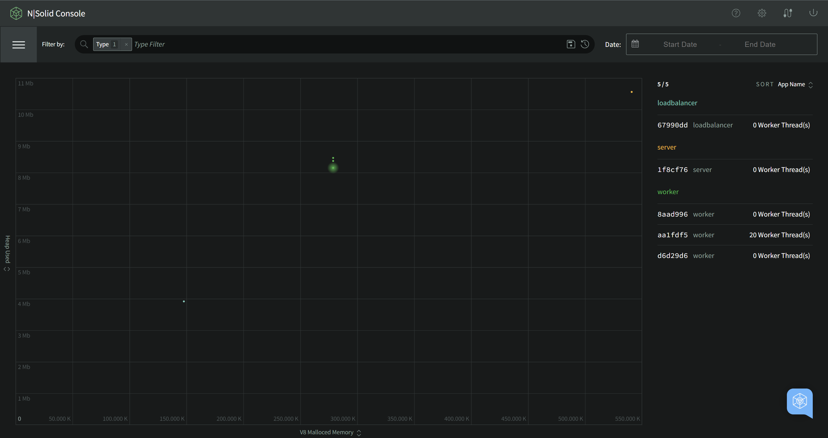
The Scatterplot
The Scatterplot is our innovative tool for high level visual observability and infrastructure search tool. It plots live data for each connected N|Solid process in a two dimensional plot of any two of our many N|Solid metrics. This lets you visually observe clusters and spot anomalous processes and outliers across a wide range of potential behaviors.
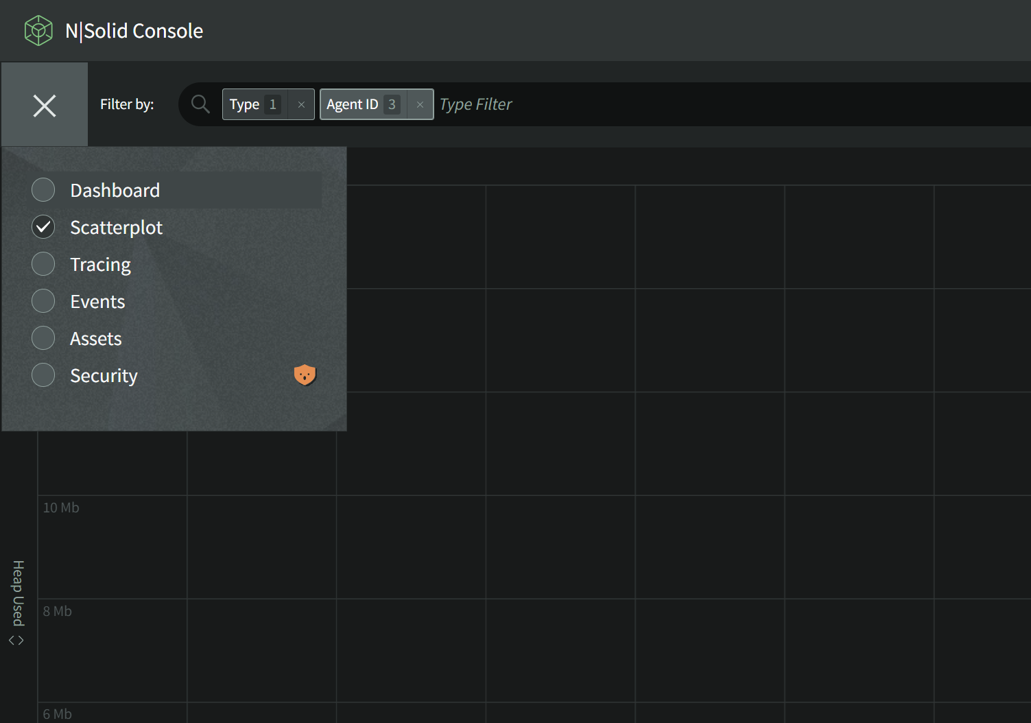
The Scatterplot can be found in the upper-left main Navigation Menu.
The Scatterplot
Changing Axes
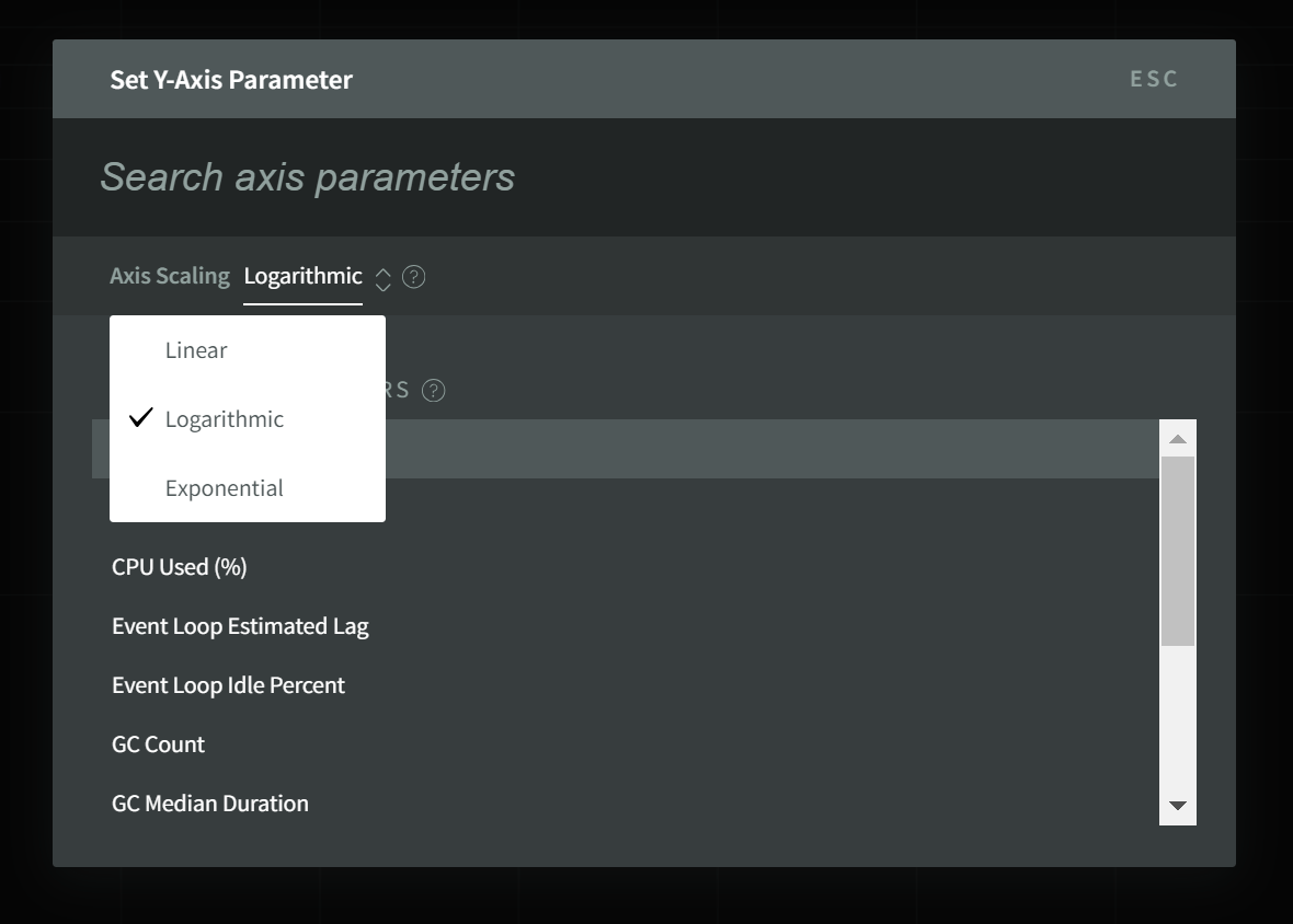
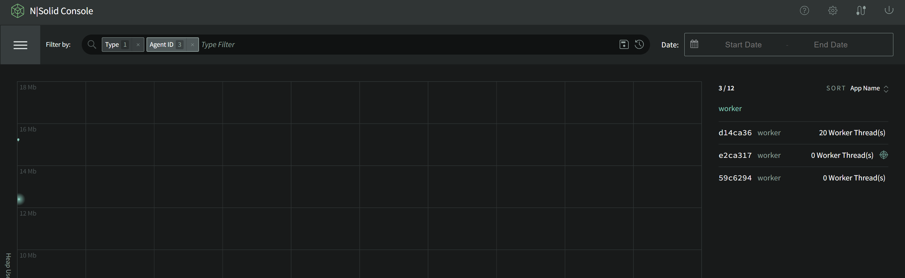
By default, the Scatterplot shows all processes showing Heap Used versus CPU%. By clicking on either axis you can change the metric shown to those collected by the N|Solid Runtime.
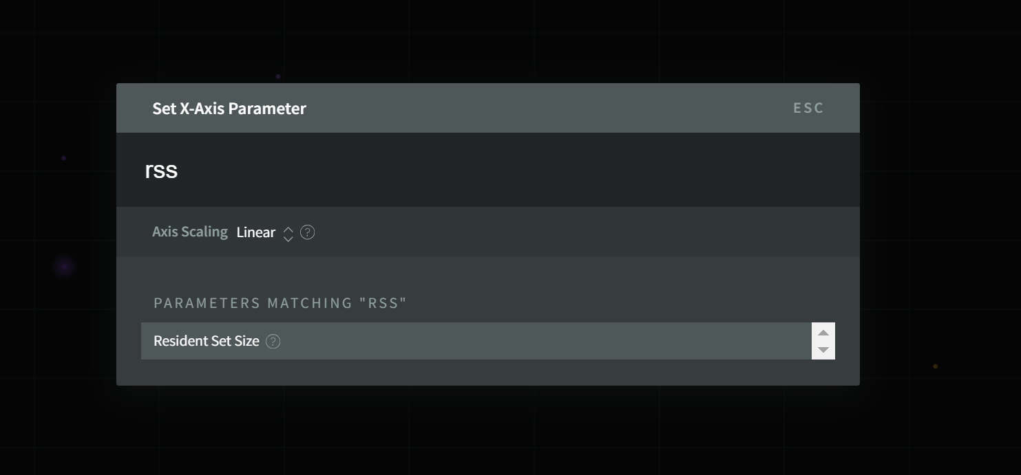
The scale of the access can also be changed between Linear (default) and Logarithmic or Exponential in order to help visually separate clusters in the lower or higher ends of the data range.
Axis Scale Examples
- Linear
- Logarithmic
- Exponential
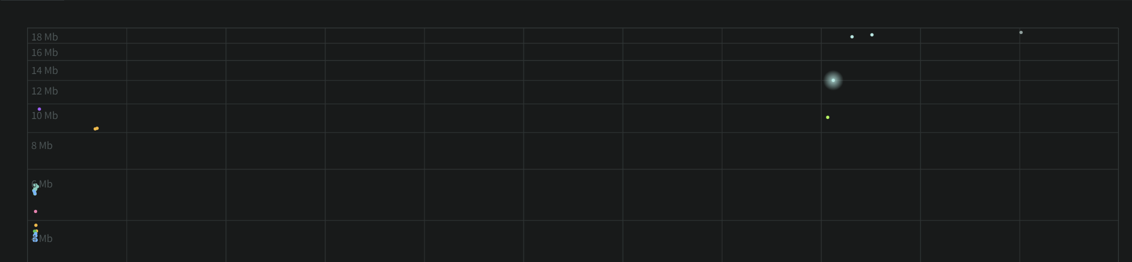
A Linear X-Axis spreads the processes evenly over the data range.
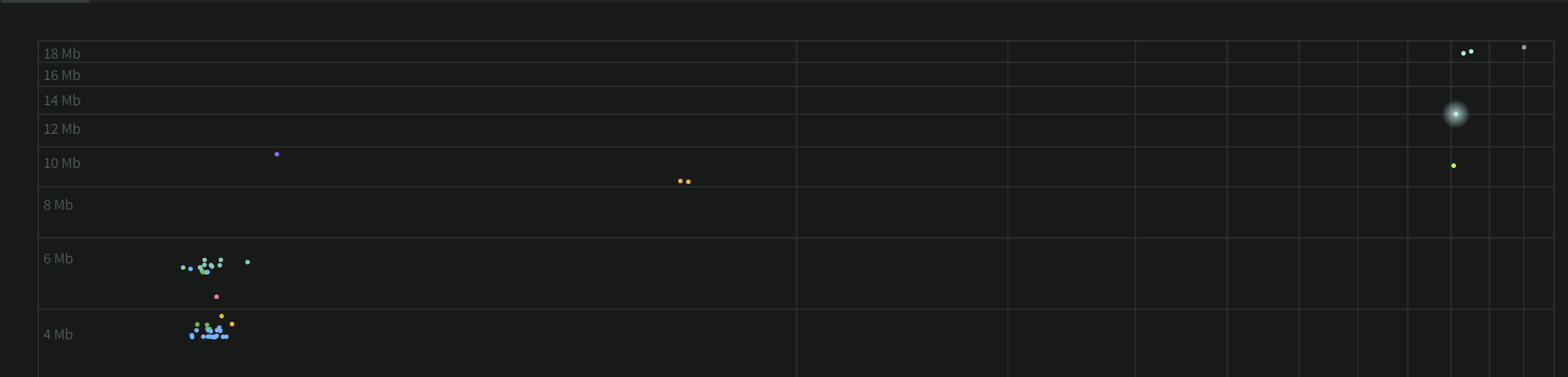
A Logarithmic X-Axis scale increases resolution of the lower range of values at the cost of less resolution on the higher values.
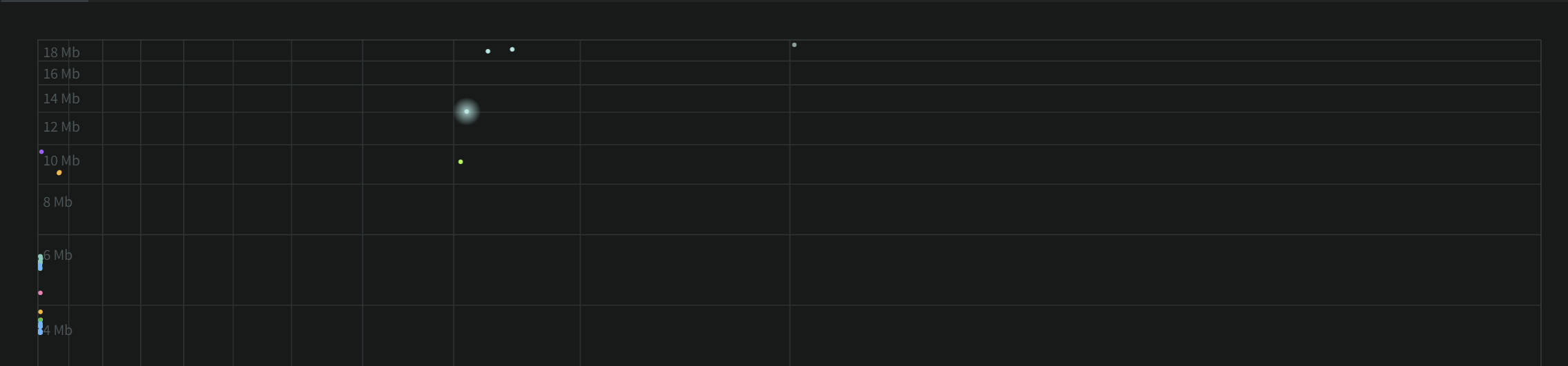
An Exponential X-Axis scale increases resolution of the higher range of values at the cost of less resolution on the lower values.
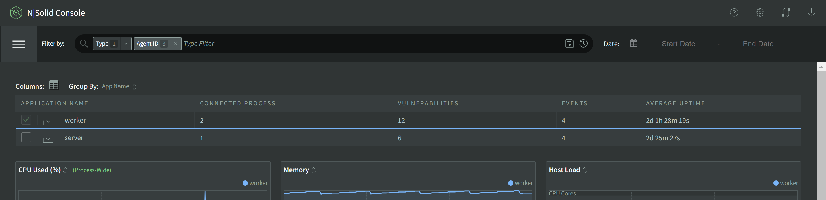
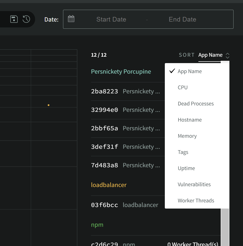
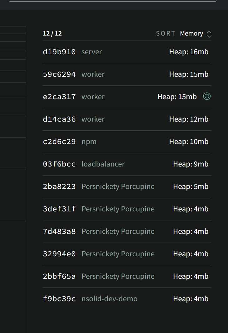
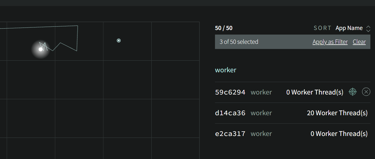
The grouping and sort order of the list can also be changed.
Here the list has been sorted by Memory (Heap Used).
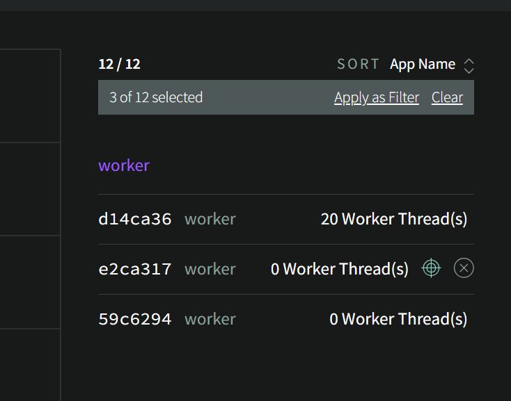
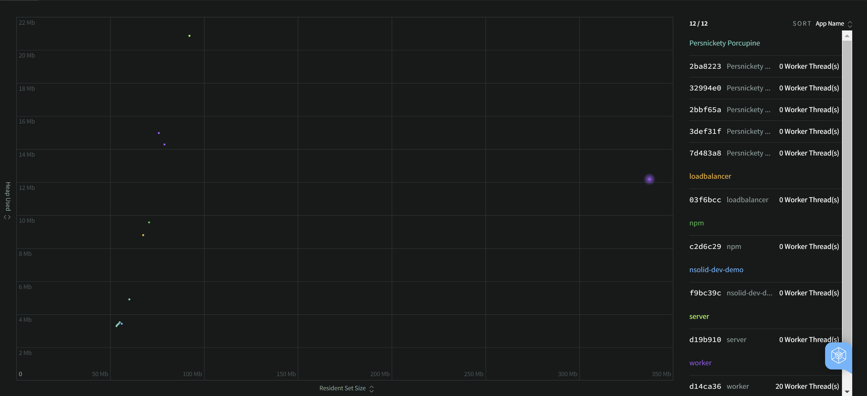
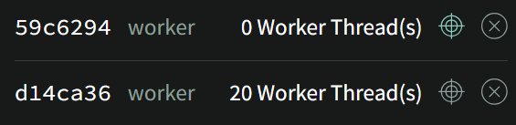
The Scatterplot can be quickly filtered by clicking on the headers on the list. Here the Appname "worker" has been selected. If I click "Apply as Filter" the list selection on the right will be transferred to the primary Filter Box allowing you to keep this filter as you navigate the other sections of N|Solid.
Visual Identification of Outliers
A primary goal of the Scatterplot is to enable easy visual identification of outliers over a wide range of metrics. In general, metrics on their own without context do not provide much utility beyond "using 100% CPU or memory is bad." The Scatterplot's realtime data representation lends visual representation to metrics context.
An "Outlier" is a member of a set that is not behaving like the rest for some reason. Not all outliers are problems, but understanding them will help you understand your application and its operation better and identify smoke before the fire. Outliers may be caused by expected variability in your data, or they could be an indication of a problematic but rare bug or memory leak. Here are a few examples of the thousands of possible ways to slice and analyze your data to identify potential issues:
Outlier Examples
- RSS Outlier
- GC Outlier
- HTTP 1
- HTTP 2
- Log Scale
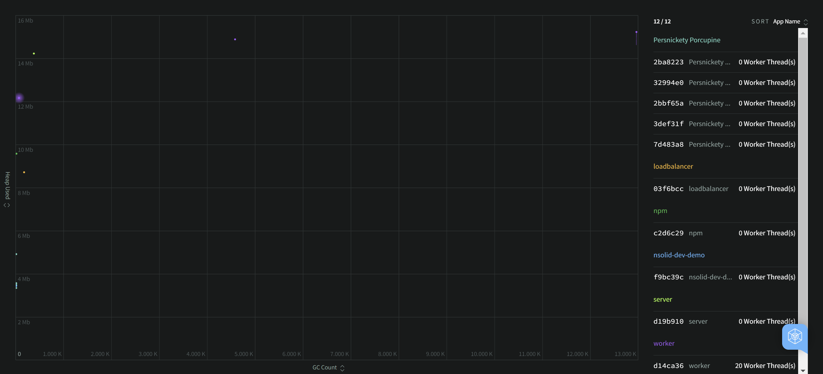
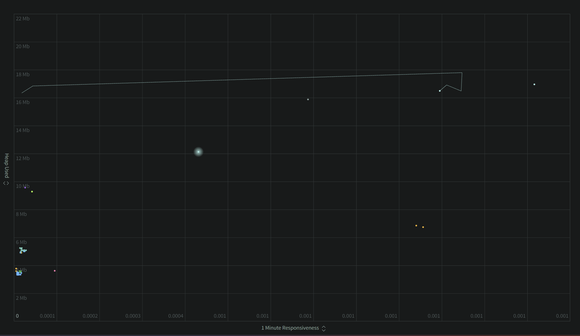
Here we can see a comparison of Heap Used vs. RSS, separating the purple dot on the far right showing very anomalous RSS use compared to all of the rest and worth investigation.
Here we can see a comparison of Heap Used vs. the number of Garbage Collections, identifying two processes with a very different GC behavior to the rest.
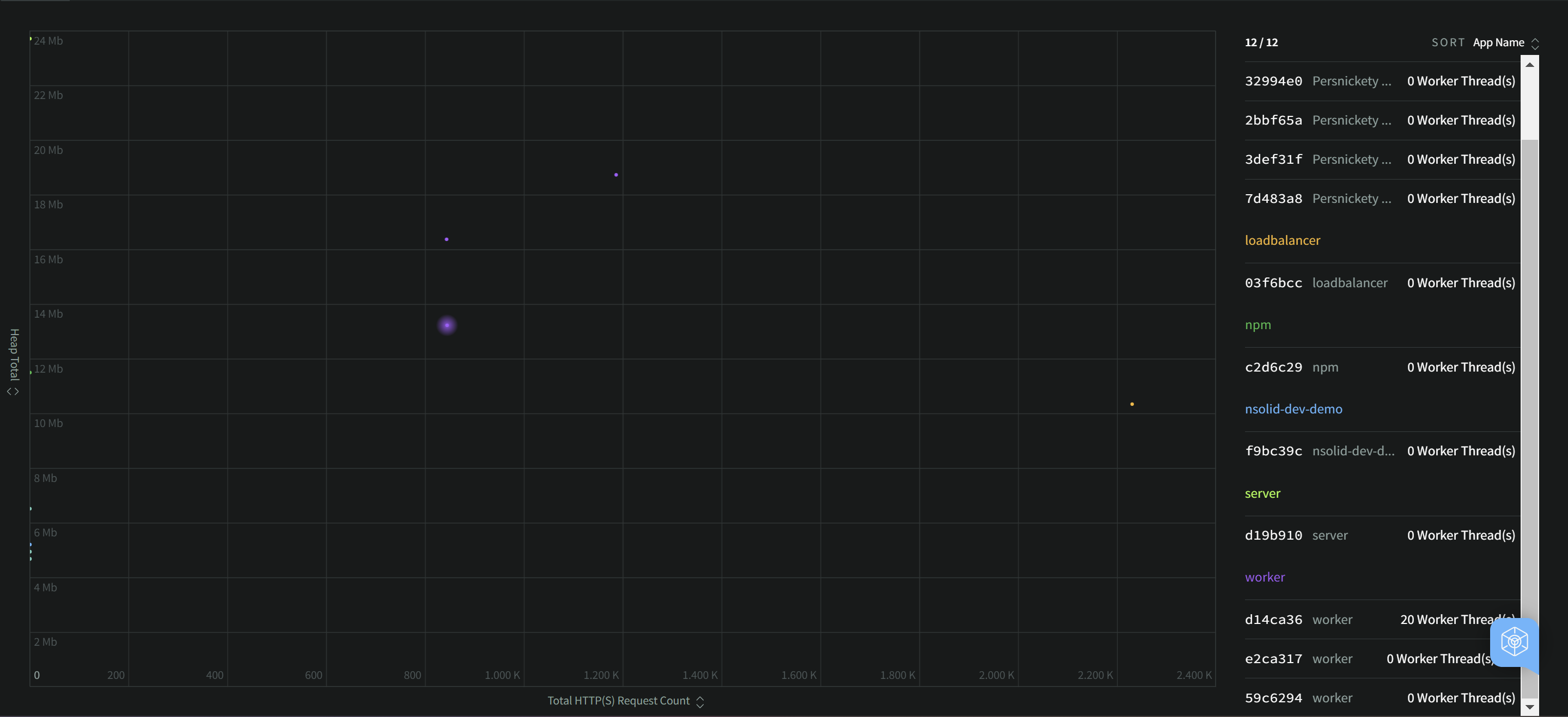
This Scatterplot is showing Heap Used versus the number of HTTP(S) requests this server has handled since startup. Some process dots on the far left are not servers, and so they have served 0 requests. In the middle we can see a breakdown of heap memory used by all of the various server processes.
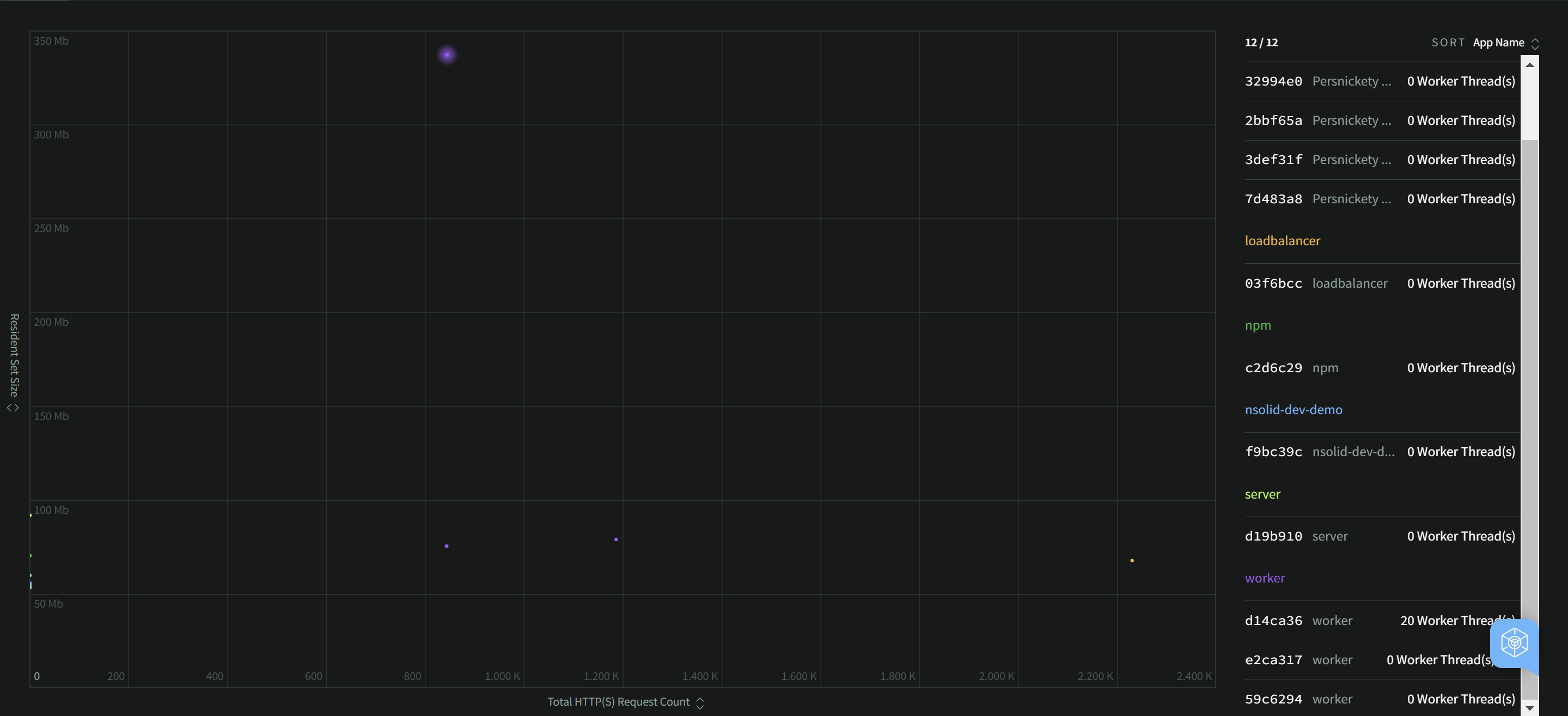
Compared to the previous example, this Scatterplot is showing RSS versus the number of HTTP(S) requests this server has handled since startup. Now we can see that one of the purple "worker" processes presents itself as an outlier in RSS use. It has significantly higher RSS use to handle a similar number of requests.
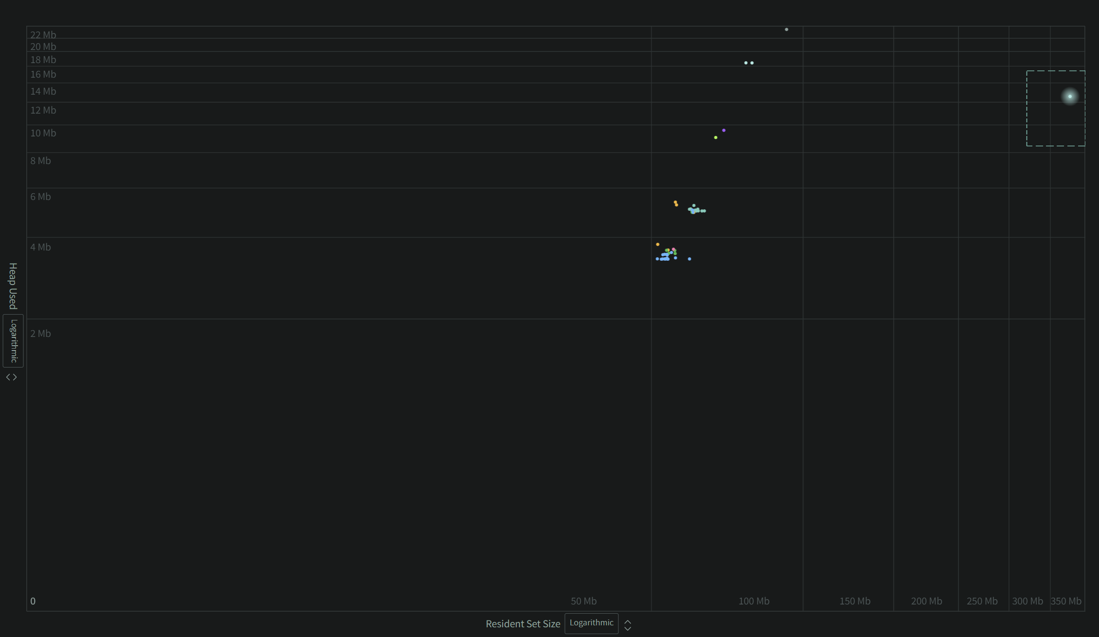
This example leverages different axes scales to push an outlier to a visual extreme.
Working with Outliers
The Scatterplot has a few additional tools for watching or highlighting processes of interest. When hovered, a crosshair icon will become visible, allowing you to select a single process dot to be tracked with a tail. This can help you see if the process is lingering as an outlier or shifting back into the group periodically.
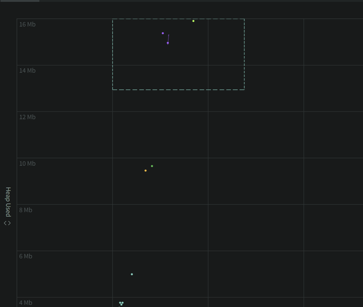
To quickly filter to a subset of processes, you can draw a box with your mouse around the desired processes and the Scatterplot process list will be filtered to this set. This can then be applied to the global Filter Box if you want to (for example) look at the historical metrics of these processes on the Metrics Dashboard.
After clicking "Apply as Filter" our Scatterplot list filter converted to a global Filter.
Now we can visit the Metrics Dashboard via the upper left Nav menu, retaining our filtered selected processes for any additional diagnostics.